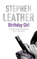
When you self-publish eBooks, the cover is the first thing the potential buyer sees. If they don't like the cover at first glance, they'll just move on and you've lost a sale.
Back in June 2012, I self-published a collection of free short stories - Short Fuses. Since then it has been downloaded more than 50,000 times, which is a success in any terms. The book is a marketing tool - along with the four free short stories I have included opening chapters of half a dozen of my bestsellers, which I hope will bring in new readers.
Recently I decided to refresh the cover, and went to Derek Murphy at creativeINDIE for advice. Derek is an expert at revamping tired covers - you can see his website HERE
I told Derek I'd like something similar, but more modern, cleaner, and with more impact.
He came back with three suggestions.
Derek figured that having FOUR EXCITING SHORT STORIES above the title would have more impact, and I agreed.
So, we agreed on the cover on the left, and I posted it on Amazon and Smashwords on April 25. I think it definitely looks cleaner and more modern, the big question I needed answering was would a new cover boost sales?
The answer is a resounding YES!
Over the first three weeks of April, I averaged 55 downloads a day.
A week after putting up the new cover, I was averaging 64 downloads a day. Yesterday more than 125 copies were downloaded.
I haven't done any promotion or advertising, all I did was change the cover. The number of downloads has more than doubled and the book is now in the Top 200 on the Amazon Free list.
You can download Short Fuses for free at myBook.to/shortfuses
Incidentally, I am currently working on a similar anthology of free short stories plus chapters of my early books. It'll be called More Short Fuses and I'm using one of Derek's other cover ideas. Watch this space!


No comments:
Post a Comment